Why start from a vector logo?
Every file a brand ships, from a 16 px browser tab icon to a 1,024 px app store image, should come from one source. If that source is a PNG, each export is a resize of pixels, and small sizes blur while large ones stay soft. If it is an SVG made of paths, each size is drawn fresh. The steps below keep one SVG at the centre and make everything else from it.
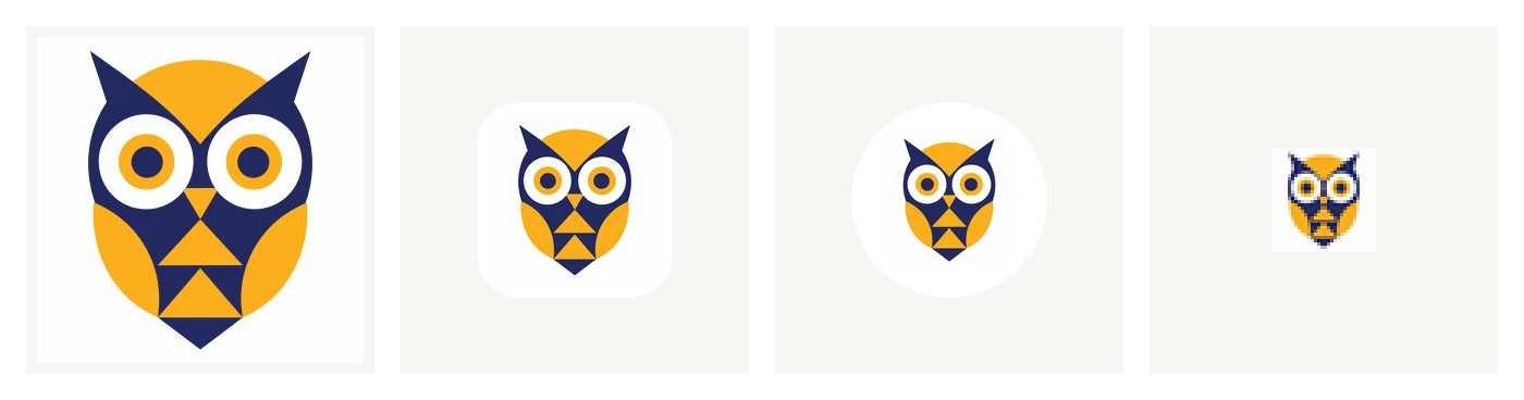
One of our example logos, then the iOS icon, the Android adaptive icon and the favicon our export tools made from its SVG. The favicon is shown enlarged; at 32 px every pixel counts.
Step 1: describe the logo and pick an idea
Open the AI logo generator and write what the logo should show: "an owl built from circles and triangles, for a study app, indigo and amber". Add the brand name if the logo should spell it. Choose a style chip if you know the kind of logo you want; the guide to logo styles explains each. Every send makes four ideas, and its price is printed on the button first.
Step 2: refine one idea in words
Pick the idea closest to what you want and say what to change: "make the R bolder", "fewer feathers", "move the sun above the peak". A refine keeps the rest of the logo. Prefer one or two precise changes per refine to a list of ten.
Step 3: vectorize it
Choose Vectorize on the logo you picked. It is traced into an SVG with each colour as its own paths, and you can check it next to the original before you use it. Open it in the SVG editor to recolour a part, delete a stray shape or change the spacing of the name.
Look at three things before you go on. At small size, does the mark still read? Are any shapes or letters touching that should not? And are the colours exactly the ones you want? Fixing them in the SVG now fixes every file made from it.
Step 4: make the app icons
The app icon generator makes, from the SVG:
- Android: density PNGs from 48 to 192 px, a 512 px Play Store image, and adaptive icon XML with a foreground inside the safe area and a monochrome layer for themed icons;
- iOS: an
AppIcon.appiconsetwith one opaque 1,024 px image for Xcode.
Choose a background colour and the padding around the mark. A mark with transparent space around it gives Android's monochrome icon its real shape. Android and iOS app icons from one image covers the import steps and what to check on a device.
Step 5: make the favicon and PWA icons
The favicon generator makes favicon.ico (16, 32 and 48 px in one file), a favicon.svg when the artwork is clean vector paths, PNGs at 16 and 32 px, a 180 px Apple touch icon, 192 and 512 px icons with maskable versions, a site.webmanifest, and the HTML to paste into your page's <head>. Which of them browsers use, and why a favicon still needs an ICO, is explained in SVG vs PNG vs ICO favicons; the maskable safe zone is in PWA maskable icons.
Or take everything at once: the Brand Kit
The Brand Kit runs the same exporters on the same SVG with one set of brand settings (name, short name, theme colour, background colour and padding) and puts the results in one ZIP:
| Folder | Contents |
|---|---|
favicon/ |
the favicon and PWA package |
app-icons/ |
the Android and iOS app icon sets |
ios/ |
an Xcode image set for using the logo inside the app |
android/ |
a VectorDrawable for using the logo inside the app |
png/ |
transparent PNGs, longest side 256, 512, 1,024 and 2,048 px |
svg/ |
the optimized SVG and the full-precision original |
Each folder holds exactly what the separate tool makes from the same input, so you can start with the kit and later regenerate one part on its own. The kit's price is shown before you download it.
Before you launch
Search the trademark register of each country you sell in for your name and for similar marks. A generated logo is new, but nothing checks it against registered marks. Keep the SVG as your master file, and add new sizes from it, never from a PNG.