The mechanism in two steps
Step one: colour reduction. The tracer picks at most n representative colours (2–24, from the slider) by grouping similar pixels from the image's flat areas, then gives every pixel one of those colours, with no dithering. On a logo with four fills this is lossless in practice. On a photograph of a face — thousands of skin tones shading into each other — it forces every pixel into, say, eight buckets. Where the original faded smoothly from one tone to the next, there is now a hard line between bucket 3 and bucket 4.
Step two: outlining. The tracer draws the boundary between every pair of neighbouring colours as one smooth curve and fills each side with a single flat colour. A filled path has no way to say "this edge should be soft": each bucket boundary from step one becomes a crisp vector edge.
Put together: a photo becomes a stack of flat, crisply outlined bands. That is posterisation, and it is inherent to region tracing rather than a defect of a particular tool. Any tracer that outputs filled paths does the same thing; the ones that appear not to are embedding the bitmap (see the guide on vector versus raster).
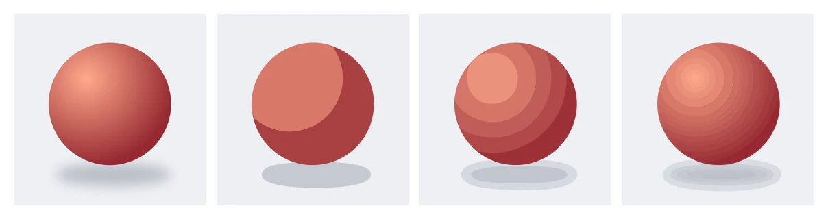
A smoothly shaded ball (drawn as a gradient, standing in for the soft shading of a photograph), then traced at 4, 8 and 24 colours. Each step adds bands; none gives back the smooth gradient. At 24 the tracer used 21 colours in 23 paths.
What the colour slider does and does not change
- More colours (up to 24): more bands, each thinner, more paths, larger file. Skin looks like a contour map with finer lines. It never converges on a photograph, because the maximum is 24 flat fills.
- Fewer colours (2–4): bold poster or stencil look. This is where tracing a photo is genuinely useful.
- Smooth curves: makes the band outlines smooth curves instead of pixel steps; it does not soften the colour steps between bands.
- Presets: Detailed artwork starts at 16 colours and otherwise works like Standard; Line art / Stencil converts to black and white first, which on a portrait produces a two-tone stencil.
When tracing a photo is the right call
- Stencils and silhouettes: a high-contrast portrait with Line art / Stencil (or 2 colours) gives a two-tone silhouette; adjust brightness in an image editor first so the split between dark and light lands where you want.
- Poster and screen-print looks: 3–6 colours, then recolour the bands in the editor to your ink colours.
- Simple product shots with flat backgrounds: remove the background, trace the object at a low count, and you have a clean flat illustration of it.
When to keep the raster
If the goal is "the same photo, but scalable", a trace will disappoint: a JPEG at a sufficient resolution is the right format for photographs, and SVG can carry one only by embedding it. Gradients in a logo are the in-between case: trace the flat parts at a low colour count, then recreate the gradient as a real SVG gradient in a desktop vector editor, which the tracer does not do.
Reading the preview honestly
The preview shows exactly the bands you will get. If it looks like a paint-by-numbers version of your photo, that is the result, and no unlock changes it. Previews are free — use them to find the colour count that gives the poster effect you want before spending a credit.